Post Summary
-
- Recently, I created a web app that leverages the Facebook Prophet python library to provide people with the ability to build simple baseline forecasts from within a guided user interface.
-
- Simply upload a csv, select a few drop-downs and a baseline forecast is generated in just 3 easy steps!
-
- This web app is a proof of concept (MVP), open source and freely available on Github.
-
- Some of the key learnings detailed in this article include how to:
- Parse a csv from within the Browser using Javascript & PapaParse
- Build a 3 step user flow using Dynamic Tabs
- Build an analytics tool that doesn’t store data in a database (it is possible!)
- Pass data from a web UI and fit a simple Prophet Model using kwargs
- Style ChartJS to look like Prophet Charts rendered in Jupyter
- Measure app performance on Heroku vs. my local machine
- Some of the key learnings detailed in this article include how to:
-
- If you are interested in learning more about this app, please check out this product page that I designed.
-
- I’m also actively looking to partner with forward looking product or marketing teams to build out awesome analytics services that help you unlock more insights from your data. If you are interested in teaming up with a passionate analytics professional, please reach out to me on LinkedIn. I’d love to hear more about what you are doing and how I can help!
What I Learned Building a UI on Top of Facebook Prophet
I remember how much I used to love building tools and dashboards in spreadsheets. Back in the day, the spreadsheet was one of my favourite analytical tools of choice. Excel (and later on Google Sheets) was the data-driven canvas from which I would create countless index-match fueled visualizations, macros and so much more. Now while spreadsheets are more powerful than ever and are still amazing tools, these days I’m spending most of my creative energy learning to build with python.
Ever since I decided to learn python, my world has changed and I can’t recommend it enough. It has really opened up new creative opportunities for me to explore and visualize information.
One day, while I was doing some research on time series forecasting (just for fun), I came across a really interesting open source python library developed by Facebook called Prophet.
What is Facebook Prophet?
For those of you not familiar with Facebook Prophet, it is a library that makes it easier for analysts to create baseline forecasts. It’s really easy to use and you can learn more about how to get started with it using python here.
I think Prophet is a really great tool if you are an analyst and fluent in python and / or forecasting in general. But as someone who has seen many a marketer building countless forecasts in spreadsheets, I thought it might be interesting to research what it would take to build a simple UI on top of Facebook Prophet.
And as someone who loves open source, I thought it would be interesting to share any code (Github repo) back to Facebook or the analytics community as my contribution to what I think is a pretty cool open data product.
Taking the Initial Steps Towards a Prophet UI
Feeling inspired and excited at the prospect of building my first open Analytics Product, I quickly reviewed some of my previous Flask apps that I had built (Open Bike Share App, ml-camera) to see if there was anything I could reuse.
I already knew that this app would probably be best experienced on desktop, so building a Flask App powered by Python and Javascript felt appropriate and played to my current strengths.
I also decided to build a rough requirements doc to capture some of my initial thinking around what could be involved with this project.
Defining Key Objectives around the UI Project
When managing any large initiative, I believe it’s important to create a requirements document outlining a key objective and any supporting tasks needed to successfully execute and deliver on said project. I’ve since revisited that doc and have cleaned it up a bit for this blog post, but here is where I landed with my objective:
Objective
Create a web service that leverages Facebook Prophet to provide people with the ability to build baseline forecasts from within a user interface.
Now, in order to execute on this objective, I outlined a few supporting tasks that would need to be completed:
1. Determine how a user can upload a file to this service
2. Create a user flow that guides a user towards building a forecast in a few steps
3. Determine how to pass user input from a web ui to instantiate and fit a Prophet model
4. Determine how I am going to visualize the forecast
5. Validate the model.
And as a bonus, I wanted to see if I can build this proof of concept without storing any time series data in a database or logs.
So, what did I learn as I completed the above? Read on to find out!
Key Learning #1: Papa Parse is really useful for parsing csvs in-browser!
Having never created a service where a user uploads a file to a webpage, I set out on the interwebs to see if there was a service that could help me:
- Upload a CSV File
- Parse and store the data into a javascript array
After many hours of researching various solutions, I eventually landed on a website called PapaParse.
Immediately, their value prop spoke to me:
“The powerful, in-browser CSV parser for big boys and girls.”
‘Yep’, i thought. ‘This is probably what I’m looking for’.
So, I took a look at their example on their homepage, researched a bit more on stackoverflow and then instrumented the following which worked quite well when I uploaded a csv file.
function parseCSVFile(e) {

  // CSV File that is uploaded
  var file = e.target.files[0];
  // we’ll store results of the parsed csv in csvdata
  var csvdata;

  Papa.parse(file, {
    header: true,
    dynamicTyping: true,
    complete: function(results) {
      csvdata = results.data;
      // Send the data to a python script app.py to process basic statistics on it
      socket.emit('send_csv', {data:csvdata});
    }
  });
}
After the data was parsed, I emit the data to app.py using a web socket to process some basic statistics in python.
So Papa Parse worked great and it was the big boy in-browser csv parser I was looking for!
Key Learning #2: Creating a User Flow using Dynamic Tabs
Figuring out how to guide a person down a path to build a forecast was definitely one of the most interesting aspects of this work.
Given that I had a goal of not persistently storing any data from the user’s uploaded csv, I challenged myself to come up with a session based solution, where I could just pass data back and forth between a client and server side python script.
Now, I’ve seen content rendered using dynamic tabs before and thought I could take a similar approach, with each tab being a step in the user’s flow like this.
these are just dynamic tabs that you can navigate to
![]()
And at the end of each step (ie. when the user clicks a call to action), the app sends the data server side where a python script processes it and then sends the updated data back and forward to the next tab (unless the user is on Step 3, then it loops).
The basic idea of user flow is illustrated below:
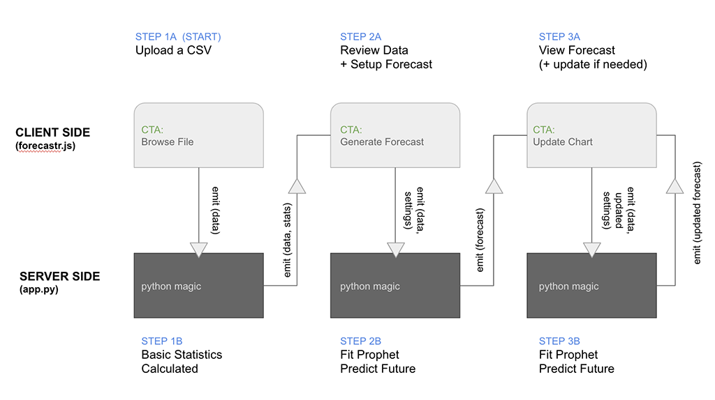
As an example, Let’s say a user is at Step 1. They’ve decided to try the app and click on the CTA “Browse File” and choose a CSV to upload. The app then parses this data and sends it server side to a python script that calculates some basic statistics about the data before sending it back and then forward to visualize on the second tab (ie. Step 2: Review Data + Setup Model).
All of the data is stored within javascript variables in the browser and is erased upon refresh / reset of the app. Pretty neat!
Key Learning #3: Passing Data from the Web and Fitting a Model with kwargs
Another fun point in the project was figuring out how to pass data from the client side and use those inputs to fit the Facebook Prophet model. At a high level, here is a flow chart for how this works:
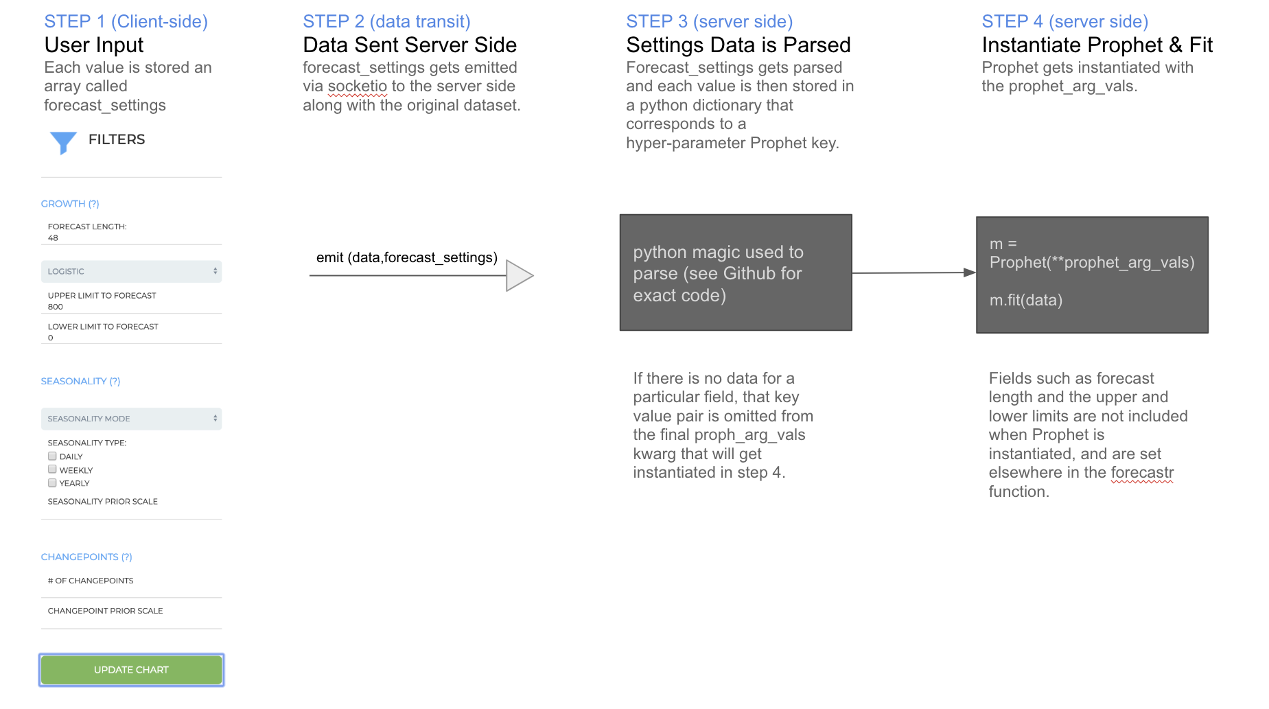
The key piece in this flow (see step 3) was to determine which fields (if any) where set from the Web UI. If a field was not set, it was not included in the final dictionary that was passed in as a kwarg when Prophet was instantiated (See step 4 above). Feel free to check out this code on github for how I implemented this.
One more note on the hyper-parameters used in this app. I excluded a few of them for simplicity sake as my main goal was to produce a mvp that could produce a simple baseline forecast. I’d invite you to reach out to your fellow data scientists if you want to create more complex and detailed forecasts using a larger range of hyper-parameters.
Kwargs are awesome and really handy. Feel free to check out this article on Towards Data Science to learn more about them.
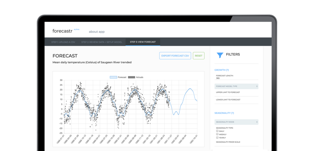
Key Learning #4: Rendering a Facebook styled forecast with ChartJS
Now that we’ve fit the model, the next step is to return the newly calculated forecast as a list so we can send this data into a chart. For this project, I decided on using ChartJS, and for those who haven’t tried out ChartJS, I highly recommend it. It’s a beautiful graphing library with nice animations and a flexible range of customization. For the most part, ChartJS should meet most of your standard data visualization needs if you are building anything custom like this.
One of the nice finishing touches about Facebook Prophet is how they style their graphs and forecasts. I actually quite like how they use dots for actuals and a line graph for the forecast. It is quite an elegant way to visualize larger time series datasets and then cut it with a line forecast.
So, here’s a link to the code for how I styled a ChartJS graph to look like a Facebook Prophet graph (which you would typically see in a Jupyter notebook.)
I still need to add in the upper and lower bounds (this data is included in the csv download) and will do this in a future iteration. But the image below shows how Jupyter and ChartJS renders the Prophet forecast using Facebook’s sample Peyton Manning Dataset.
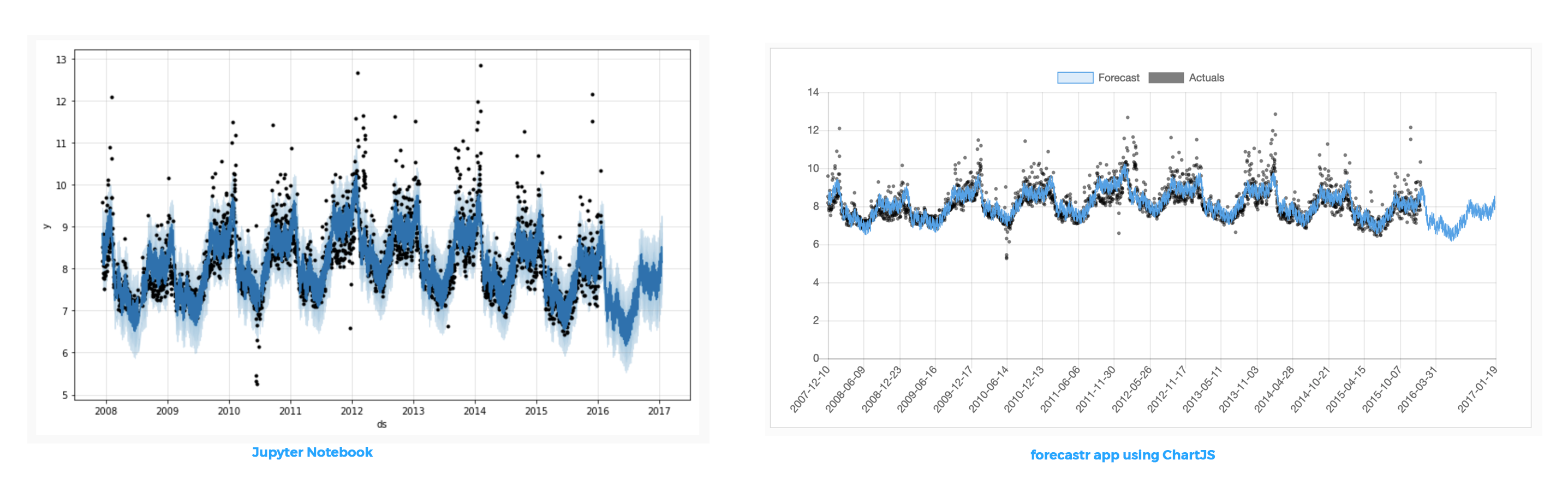
The forecast looks pretty great in ChartJS and closely aligns to Facebook’s graph.
Final Thought and Question: On Application Performance
One of the things I noticed when developing this app was the significant drop off in performance when pushing to production on heroku. By performance, I mean how quickly the forecast is rendered from the initial request on step 2 to fully being drawn on step 3.
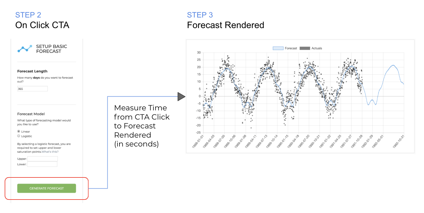
So, I set up and ran 30 forecasts locally vs on heroku to quantify the difference between these two environments. I used the Saugeen River Temperature dataset, forecasting out 365 days with a linear model (see settings above in Step 2). I was actually quite surprised by the results. I knew that the app would perform faster locally, but not 17.5 seconds faster! That’s a bit much for my liking :).
Here are the results:
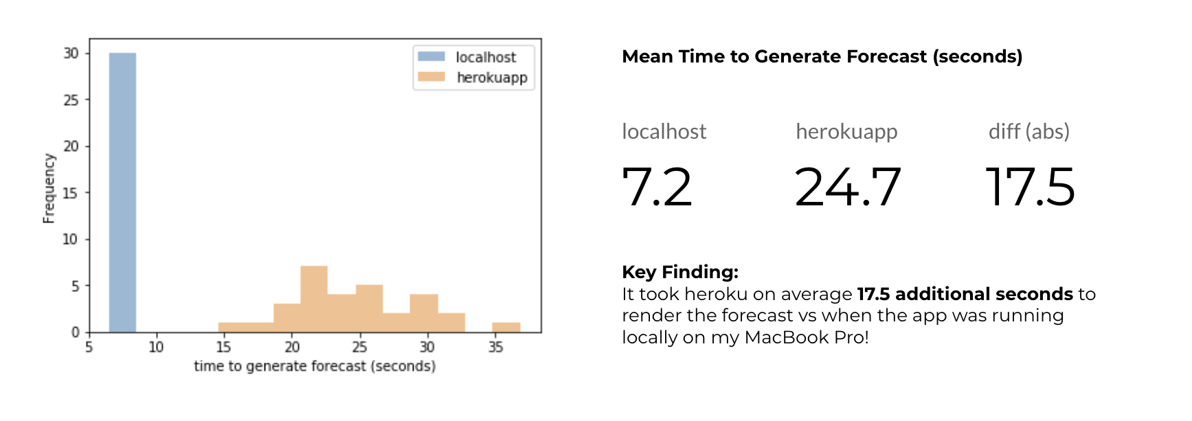
So, being an open source project, i’d love to ask the analytics community with some help here. If I were to switch over and deploy this app on AWS or Google Cloud, do you think I could see some performance gains? I’d love for it to be as quick as on my local machine. Any other thoughts on what I could do to improve this? Feel free to clone this repo and see the difference for yourself!
Unfortunately, with the performance not being fully optimized, I decided not to include any model validation in this first iteration of the app…(queue the Price is Right disappointment sound)
That’s a wrap! More to come in future posts!
Whew! If you made it this far, that’s awesome and I want to thank you so much for checking out this blog post. I really enjoyed building this app and there is a lot more that I learned which I didn’t include. If you have any feedback at all, I’d love to hear it! Please leave a comment below or reach out to me on LinkedIn.
I must say that I’m truly amazed by how much quality open source technology is out there to even begin to building things like this. I really want to thank all of the awesome people who made Facebook Prophet, ChartJS and Flask. You guys are the best!
About the Author: Gareth Cull
I’m actively looking to partner with forward looking product or marketing teams to build out awesome analytics services that help you unlock more insights from your data. If you are interested in teaming up with a passionate analytics professional, please reach out to me on LinkedIn. I’d love to hear more about what you are doing and how I can help!
I recently founded the analytics startup called Data Narrative Inc. and provide clients with strategic direction and full end-to-end measurement-based solutions that maximize their competitive advantage in order to increase sales, marketing and product effectiveness.
Comments